
Increasing conversion rates:
AI summaries of customer reviews
Accelerating user decision making process by providing concise and specific AI summaries of customers’ reviews, achieving an NPS of 71%.
Proof-of-concept
Gen AI
Web & Mobile


View this project in Figma
View Mobile Hi-Fi Prototype
View Web Hi-Fi Prototype
ROLE
Product Designer
TIMELINE
Nov’ - Dec’ 2025
TOOLS
Figma, Figjam
* This is a personal project
OVERVIEW
Easing customer dissatisfaction by reworking user flows
NLT is a Lithuanian youth organization based in the Netherlands. Thus far NLT has only operated through 2 social media accounts and a Whatsapp group, which can no longer sustain and sufficiently inform their growing community.
PROBLEM
NLT’s users are frustrated at how many steps are involved in the search for NLT’s Information Package, any upcoming events or important information as well as how much effort it takes for them to always stay in the loop.
SOLUTION
NLT’s users are frustrated at how many steps are involved in the search for NLT’s Information Package, any upcoming events or important information as well as how much effort it takes for them to always stay in the loop.
IMPACT
NLT’s users are frustrated at how many steps are involved in the search for NLT’s Information Package, any upcoming events or important information as well as how much effort it takes for them to always stay in the loop.
Uncovering the problems
CONTEXT
Everyone wants to smell good
Chances are you own at least 1 perfume. Maybe you smelled it on someone and liked the scent, maybe you went to the store with the sole goal to buy a fragrance. But what if you only heard a recommendation online? Or briefly smelled a perfume and didn’t know if you should spend a couple hundred euros on it?
That’s where customer reviews come in. You can quickly find out the general consensus on a fragrance - what’s the rating, what positive and negative aspects people are mentioning, how it smells and how long it lasts. This knowledge allows you to form an opinion about the perfume and make a comprehensive decision whether to buy it.
PROBLEM
Creme de la Creme doesn’t have product reviews
Lithuania’s largest luxury chain of perfume boutiques - Creme de la Creme - has a highly respectable reputation, a wide selection of world-class perfume houses and countless praising reviews about their customer service. But no reviews about their products anywhere on their website.
Creme de la Creme’s perfume prices are aligned with the high-end brand, with the 100 ml bottle prices ranging from 200 to 1500 euros. Such a high price point means that not everyone can afford these perfumes.
But that just shows that the people who do end up spending so much money on a fragrance need to be absolutely sure about their choice. Data shows that reviews are a crucial step in the users’ decision making process, allowing them to read other customers’ opinions, compare them with their own taste and ultimately make a confident purchase.

95% of consumers
Read online reviews before making decisions
68% of consumers
Form opinions after reading 1-6 reviews
Products with more than 9 reviews generate
52% more revenue
Customers tend to spend 31% more on
highly reviewed products
OPPORTUNITY
Perfume reviews could be even more useful
Review sections still rely on the user doing the heavy lifting themselves - wading through pages of reviews, thinking of ways to sort them by the specific criteria they are looking for. This leads to users feeling overwhelmed and frustrated by the sheer volume of reviews, their vagueness and often contradicting information.
And right here lies an opportunity - Creme de la Creme could leverage Gen AI by adding concise and specific summaries of customers’ reviews in product pages in order to help users quickly and confidently make purchase decisions.
BUSINESS GOAL
Creme de la Creme wants to improve conversion rates on the checkout page.
USER NEED
Creme de la Creme’s users need a way to quickly understand the general consensus about a product in order to decide on a purchase.
CONSTRAINTS
A website redesign is out of scope, therefore new features must adhere to Creme de la Creme’s established website structure and design system.
RESEARCH SUMMARY
Users, above all, want clarity and specificity
After carrying out a competitive analysis of the largest perfume retailers and user interviews with 7 participants, these were the key insights.
Summaries need to be easily scannable and relevant
All 7 participants said they often skip AI summaries that are a block of text with nothing standing out, stating that in some cases these summaries are even worse than what they are summarizing - they are difficult to read, surface-level and not informative enough.
Categories have to correspond to users’ needs
It became apparent from the user interviews that the most important information that participants want to know about a perfume is how it actually smells (because perfume notes don’t necessarily smell as described), how long it lasts (because luxury perfumes are quite expensive) and some specific extras that other people have noted as important.
Participants expressed that having more than these essential categories is superfluous.
Filters need to be specific
All 7 participants said they really like the ability to filter reviews by specific keywords from the summaries, but 5 of them wished they would be more specific to the perfume they’re about.
The use of Gen AI needs to be indicated clearly
A few of participants expressed their distrust in Generative AI, saying that in some cases, when it is directly useful for their tasks, they will use it, but otherwise most likely not. In order to build trust through transparency, content generated with any use of Gen AI needs to be noted for all users to see.
How Might We...
Create a website that makes offers straightforward navigation and
FEATURE ROADMAP
Streamlining the MVP’s feature set
After synthesizing the research findings, I outlined broad-level features in order of priority. Creme de la Creme offers not only perfumes but also haircare, skincare and bodycare products. However, I decided to limit the scope of this project to just fragrances, since they are the brand’s core products.
The MVP incorporates a review section and an AI summary card to all perfume pages. In the future, next steps would include adding review sections and AI summary cards to all other product pages. And a future consideration would be some sort of rewards system to motivate customers to leave reviews, since the more reviews products get, the more extensive their AI summaries become.

Once I established the priorities, I turned insights into features and outlined the structure of the review section and the AI summary card within.
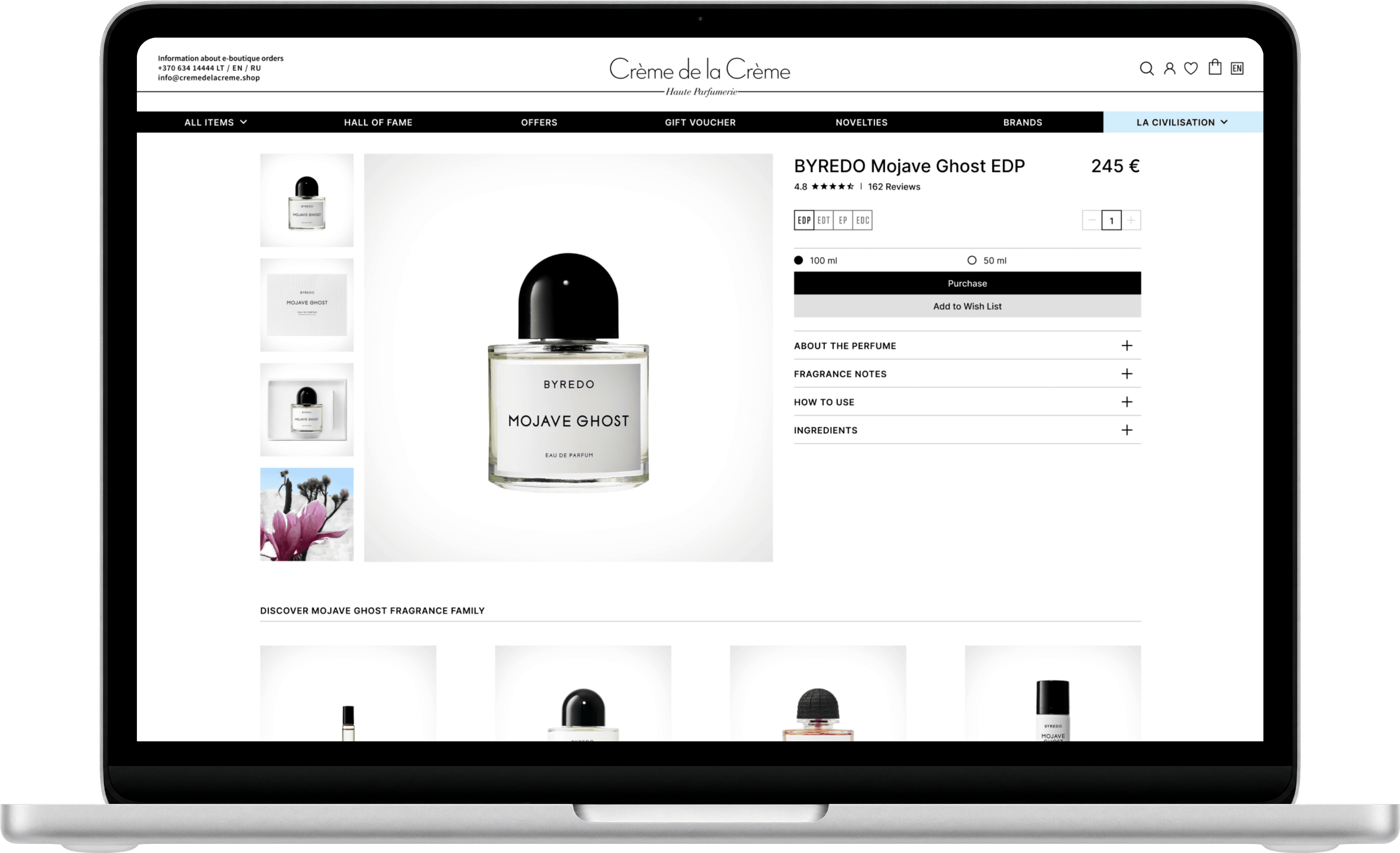
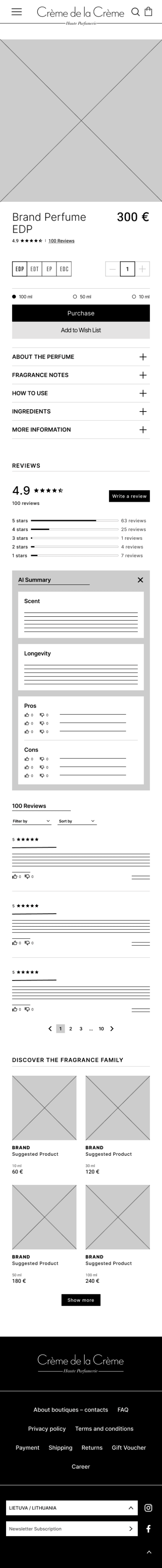
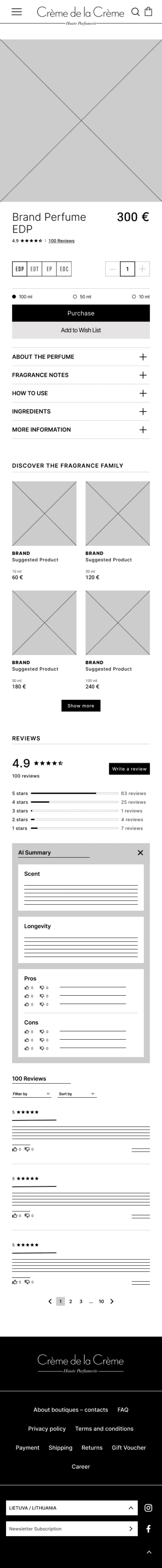
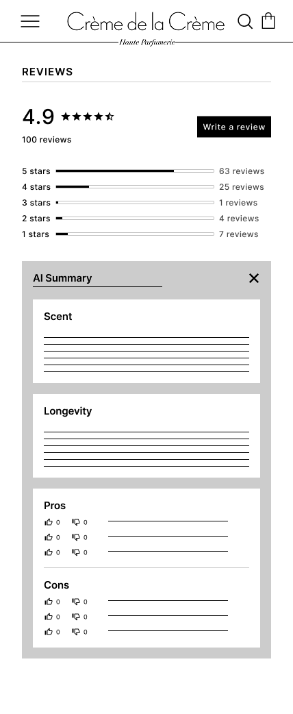
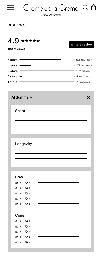
Review section
A section on every perfume page containing customers’ reviews.
Overview
The general rating, the amount of reviews and star rating distribution.
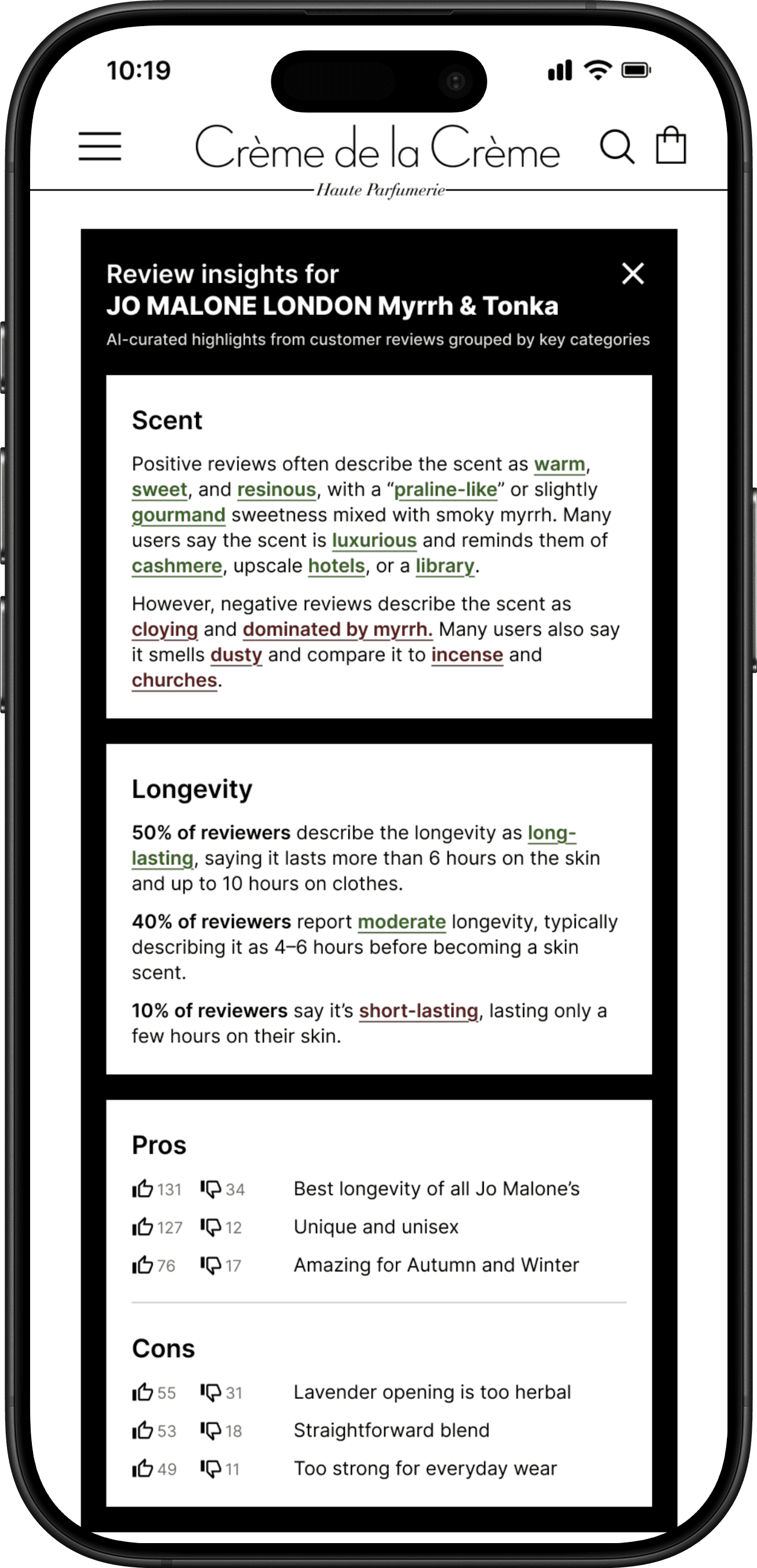
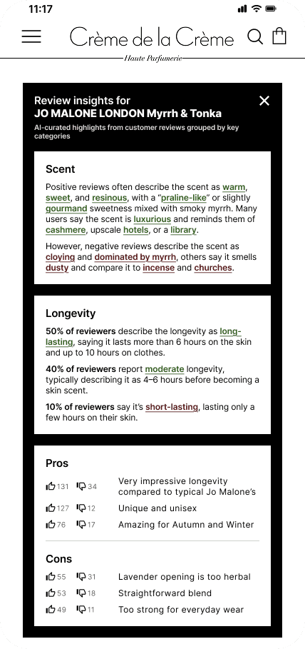
AI summary card
3 categories with short paragraphs and highlighted keywords that filter reviews.
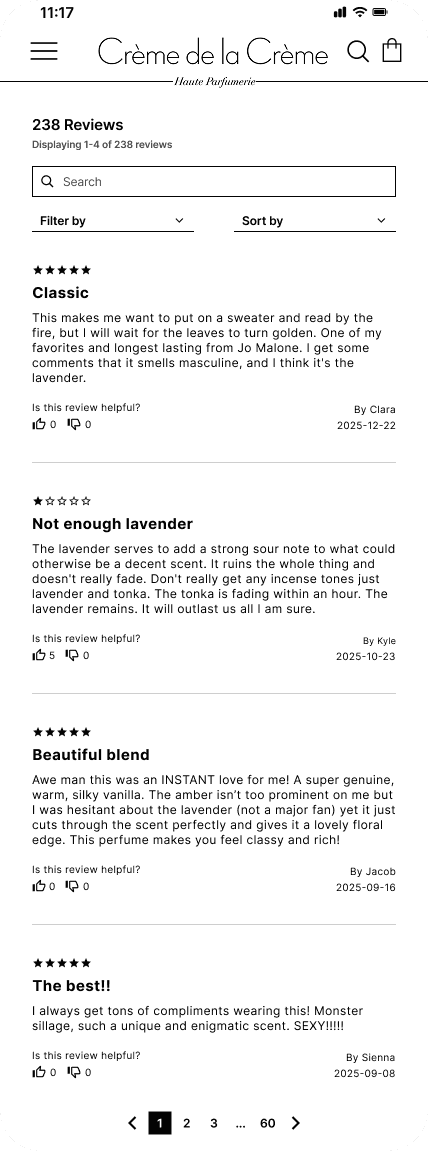
All reviews
All reviews written by customers with navigation in page format.
AI summary card
3 categories with short paragraphs and highlighted keywords that filter reviews.
Scent
Most often used positive and negative descriptions about the perfume’s smell.
Longevity
Calculated percentages of customer-reported longevity.
Pros & Cons
Most often mentioned additional positive and negative information.
Designing & Iterating
DESIGN CHALLENGES
Technical limitations/Constraints made their appearance
While designing wireframes, technical limitations made their appearance. I needed to integrate the review section into Creme de la Creme’s existing website structure and design system and make it look seamless while also making it stand out. This process shows the decisions and trade-offs I had to make.
There were several design challenges.
How do I decide on the placement of the review section?
The only content Creme de la Creme displays on perfume pages is photos of the product, a description with an Accordion menu and suggested products in the so called Fragrance family. I needed to decide where to place the review section.
I decided to go with the Mobile-first strategy and start with Mobile wireframes, because data shows that most users shop online on their phones, and then move on to Web wireframes. I came up with 3 placement options which I evaluated by doing a Competitive analysis and examining the best practices for review section placement.
OPTION 1
Above suggested products
This placement is not considered a best practice and interrupts the expected user flow.
Discarded
OPTION 2
As last Accordion Menu item
At first seemed the best fit - it gave users the option to open or close the review section while maintaining Creme de la Creme’s minimalistic design.
However, once I moved on to Web wireframes, it became apparent that it won’t work because once the review item is opened, the section overflows to the entire screen width and looks cluttered and overwhelming.
Discarded
OPTION 3
Below suggested products
This layout option was most commonly used among the sites I examined and it worked well on both mobile and web wireframes, so I ended up implementing it on all screen sizes.
Chosen
MOBILE OP. 1
MOBILE OP. 2

MOBILE OP. 3
WEB OP. 2

How much information do I put into AI summary cards?
I explored giving users the option to view either 3 or 5 Pros and Cons about a product. 5 would, in theory, give users more of an overview. But in reality, research shows that more options often leads to choice overload.
The goal was for users to get a quick snapshot of the most important information, which could fit on their mobile screen without the need to scroll. I ultimately chose brevity over comprehensiveness.
OPTION 1
OPTION 2
How should the keyword filtering work?
The standard way of filtering reviews is by filtering them by 1-5 star ratings, by sorting them by date or votes and by searching for specific words in them.
I envisioned the AI summary card having even more comprehensive filtering capabilities which would allow users to combine groups of filters - the afore mentioned ones with the ones from the Scent and Longevity categories to save users time by narrowing down reviews as precisely as possible.
How do I make viewing AI summaries not only useful but also fun?
I got the idea to make the Pro & Con category interactive from Fragrantica, which let’s logged in users vote across 10 different pro and con statements. It’s a well liked feature that is fun for users while boosting engagement for the platform. I decided to implement it because it would contribute towards the business goal - increasing engagement with Creme de la Creme would increase interest in their products, which would also increase conversions.
The only thing I decided to change was to make participating easier by not requiring the users to log in. This would simplify sharing your opinion about a fragrance without having to write a full review. And these votes would create the same effect as the other categories in the AI summaries - provide a quick snapshot of information - because the pro & con statements are constantly reordered by likes to show current attitudes.
USABILITY TEST
Iterating based on user feedback
Moderated usability tests with 7 participants validated that AI summaries reduce information overload, give a balanced perspective and accelerate the decision-making process but revealed areas for improvement. Insights led to refining the filtering capabilities and adjusting the keywords.
Picking the right keywords
Insight: Users found some highlighted keywords less useful as reviews filters than other not highlighted words
Action: Turn both the broad descriptors (like “dusty”) and the specific words customers use (like “incense” and “churches”) into review filters.
I hate perfumes that smell like the inside of a church so I would love to see how many people had the same thought
BEFORE

AFTER
Adding a search bar for improved filtering
Insight: Users pointed out that a search bar would add even more filtering customization.
Action: Add a search bar for users to search for specific things that didn’t come up in the AI summary subsection.
I have specific things I don’t like in perfumes and it would be great if I could see if anyone has mentioned them
BEFORE

AFTER
Improving the filtering indication
Insight: Users were unsure about the possibility to filter reviews by 1-5 stars in the review overview subsection.
Action: Rework this field to be broadly understandable as clickable.
It didn’t look like I could filter reviews by 1 star here so I didn’t even try
BEFORE

AFTER

The Final Design
WEB

MOBILE

MOBILE cont.

KEY DECISIONS
Key decisions
Tailoring the layout for scannability
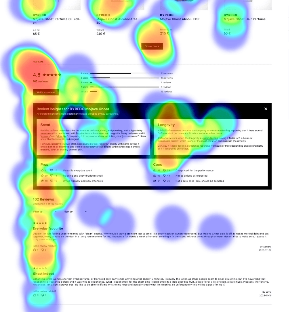
Taking into account users’ need to quickly scan the page for something to catch their eye, I arranged elements to fit the F-shaped pattern with ratings, titles and CTA’s on the left and other valuable but not that necessary information (like review dates and authors) on the right. Heatmap tests with users validated this decision.
Making the AI summary card collapsible
With the use of Gen AI it’s always important to give users the autonomy to opt out, so the AI summary card is equipped with a button to close it if necessary. When the card is closed, the perfume’s brand and name is still displayed, helping users to remember which products reviews they are reading.
I also put emphasis on preserving the interaction experience by carefully choosing which button to pick to collapse the card. Creme de la Creme uses 2 types of interaction symbols: X and + symbols and up and down arrows. I noticed that they were used for different pusposes - up and down arrows signal that a small area can be expanded for the user to pick a choice, while X and + symbols show that a bigger area can be closed or opened. I chose Option 1 in order to keep the experience the user is accustomed to.

Making the AI summary card fit on the mobile screen
I envisioned the AI summary card as a “fragrance in a nutshell” section, which would provide the customers’ general consensus on a perfume while fitting perfectly on a mobile screen without needing to scroll.
This idea proved really successful during the usability test with participants happily exclaiming that it’s the perfect snapshot of a perfume, containing all fo the information they would look for. 1 participant even stated that they could see themselves screenshotting the AI summary cards of different perfumes to keep in their photo gallery as a reminder of perfumes they are deliberating on buying.
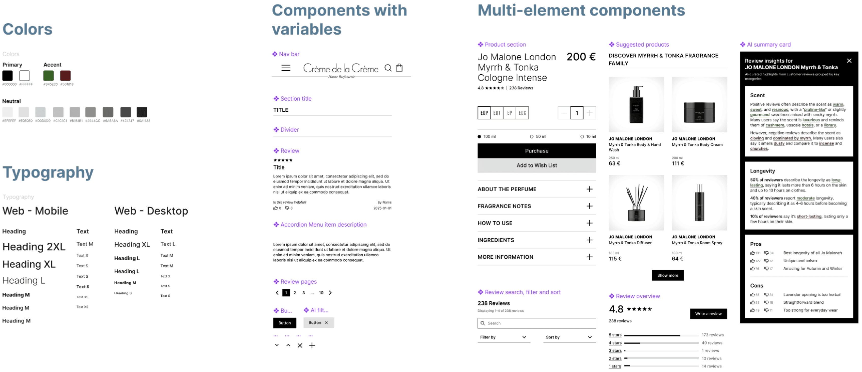
Creating a design system for scalability
This projects scope contained only review sections and AI summary cards for perfumes. However, I strategized and designed with the anticipation that the feature roadmap would include all other product categories that Creme de la Creme has. So it was important to create a modular and scalable design system, whose components could be easily reused and edited across all designs.
Impact
All of the participants were already familiar with Creme de la Creme and some of them were the brand’s customers. Overall, providing users with AI summary snapshots proved very successful - all of the participants not only found that my proposed features were really helpful for deciding whether to buy a fragrance, but some also said that they would actually purchase their first perfume from Creme de la Creme despite the high price point (which had deterred them beforehand).
100%
found helpful
71%
Net Promoter Score
REFLECTIONS
Lessons and takeaways
This project was personally very satisfying to design. I have been a customer of Creme de la Creme for a long time now and an even bigger fan of Fragrantica. The first thing I do after finding a nice smelling perfume is go to Fragrantica to look for notes and read through reviews. Which is why it was frustrating that Creme de la Creme didn’t have any.
What I learned
Design systems are a crucial part of every project
Even if at first glance a project seems small in scale, there are always possibilities for future expansion.
Starting from not only designing but also strategizing with the future in mind is highly beneficial to avoid accumulating UX debt.
The details matter
Even the smallest details of a design are there for a reason - if not for the visual hierarchy, then for the interaction experience.
It’s therefore important to create design system components mindfully because they wil shape user behavior.
A little fun can be useful
Elements that bring enjoyment to users are also valuable for the business.
Delightful UX transforms mundane interactions into memorable experiences increasing engagement, reducing frustration and cultivating brand loyalty.
What I would do differently
Conduct surveys
I only interviewed users to get their insights and feedback.
I would carry out surveys to reach a broader group of users.
Conduct A/B testing
I mostly relied on feedback meetings and usability tests to align goals and resolve issues.
However, A/B testing enables data-driven decisions, not just opinions, while cutting down on time-consuming iterations. It would also narrow down options and reduce NLT’s cognitive load.