
Reducing task abandonment:
Designing and building a scalable website
Accelerating user decision making process by providing concise and specific AI summaries of customers’ reviews, achieving an NPS of 71%.
Responsive website
Web Design


ROLE
Freelance Product Designer
TIMELINE
Sep’ - Dec’ 2025
TOOLS
Figma, Wix, Figjam
OVERVIEW
Easing customer dissatisfaction by reworking user flows
NLT is a Lithuanian youth organization based in the Netherlands. Thus far NLT has only operated through 2 social media accounts and a Whatsapp group, which can no longer sustain and sufficiently inform their growing community.
PROBLEM
NLT’s users are frustrated at how many steps are involved in the search for NLT’s Information Package, any upcoming events or important information as well as how much effort it takes for them to always stay in the loop.
SOLUTION
NLT’s users are frustrated at how many steps are involved in the search for NLT’s Information Package, any upcoming events or important information as well as how much effort it takes for them to always stay in the loop.
IMPACT
NLT’s users are frustrated at how many steps are involved in the search for NLT’s Information Package, any upcoming events or important information as well as how much effort it takes for them to always stay in the loop.
Uncovering the problems
CONTEXT
Shifting focus back to core users
NLT (Lithuanian Youth Organization in the Netherlands), established in 2022 in the Netherlands, helps Lithuanians who recently moved to the Netherlands to study integrate into Dutch society as well as nurture Lithuanian culture by hosting educational and entertaining events.
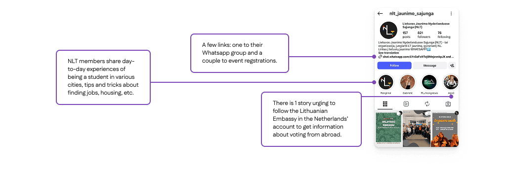
Thus far, they have operated through 2 social media accounts - Instagram and Facebook - where they post announcements about events and conferences as well as share about life as a student in the Netherlands. They also have a Whatsapp group with more than 800 members, where they provide their Info Pack - a PDF document with 29 pages of all necessary information for newcomers to the Netherlands.
NLT came to me with the need for a website. They recognized that although they have created a tight knit community on their social media accounts, new users might feel abandoned and overwhelmed by having no concrete place or way to get to know NLT, what they offer and how they can help. And since NLT’s whole goal is to help newcomers, something needed to change.
AUDIT
Going undercover as a user
Now it was time for me to start figuring out what the problems I need to solve actually are. I begun by auditing NLT’s social media accounts. Since I needed to familiarize myself with NLT, I was actually acting as a new user - I heard that they offer help and organize various events and I want to look for them. In the process I ran into many questions.
Guessing the Info Pack’s location
From the meetings with NLT I gathered that the Info Pack is one of the key values they provide new users, but I found the way to access it very confusing. I mapped 2 user journeys I (and perhaps other new users) took:
First attempt
I thought the Info Pack must be somewhere on NLT’s social media accounts, either among posts (e.g. pinned), among story highlights or in the bio. After some trial and error I clicked their links in the bio and 3 links popped up, neither of them being a link to the Info Pack. So I abandoned my search and went straight to NLT and asked where I need to look. This revealed that there could be users that abandoned the search and left without any help received.

Second attempt
I learned that I was on the right track and needed to click the Whatsapp group in the bio. After I joined the group, the Info Pack PDF was a pinned message in the chat. Switching apps was unexpected and might have also deterred users who felt hesitant to join the Whatsapp group. I later noticed that I missed a story highlight containing screenshots of the Info Pack because it was the 9th out of 11 highlights and required some scrolling to get to it.

Important advice is buried
In the meetings NLT stated the importance of sharing relevant and timely information with users, be it the university application process or how to vote from the Netherlands. But I found that this information lies not among posts but in story highlights, and often buried among less serious stories. Users might not have enough patience to comb through seemingly impractical posts to find a nugget of gold.
Lack of structure
Overall there is no hierarchy or distinction among posts of different kinds. Fun social events blend in with career conferences and NLT’s management elections. Users see a wall of bright posts competing for their attention and could be overwhelmed by where to start.
USER INTERVIEWS
Users are frustrated by the lack of structure
Having studied abroad myself, I knew how stressful it can be to suddenly be responsible for figuring out the procedures of a life in a foreign country and how badly you wish to have some help with it. I have also scoured the internet for informative resources and was frustrated and confused by their structure. Much like I was confused by what I discovered by searching through NLT’s social media. But I treated my thoughts as assumptions and turned to users.
I conducted interviews with 3 new and 3 long-time followers of NLT, aged 19-24, living in all across the Netherlands in order to gauge their key pain points. After creating an Affinity map to find patterns in the users’ attitudes, these 3 insights emerged. Many of the users’ frustrations validated my assumptions but also uncovered new issues that needed to be addressed.
Info Pack’s user flow is so convoluted that it leads to task abandonment
Users’ main frustrations:
Very frustrating process to find and download the Info Pack PDF.
The PDF keeps getting lost and needs to be redownloaded in the same process.
Have to manually scroll to find a specific section.
Searching for events is an isolated task that often leads to missing out
Users’ main frustrations:
No overview for this month’s events; events are scattered among other posts.
Social media algorithms might not show some posts.
Registration links are in the account’s bio.
Important information is either undisclosed or invisible, leading to not knowing.
Users’ main frustrations:
Confusion about NLT’s partners, how to find them and how they can help users.
Important notices get lost among other posts.
PERSONA
Who I’m designing for
I noticed that many of the users I interviewed had similar experiences, so I created a persona to guide my decisions.
Laura
19 years old, just finished highschool in Lithuania and moved to the Netherlands to study Business Administration in the University of Amsterdam.
Goals
Needs information about living in the Netherlands as a student - housing, registration, transport, etc. Wants to belong to a community of Lithuanian students, find friends and attend fun events.
Pain Points
Language barrier. Overwhelmed by the responsibility of finding information all on her own. Not knowing where to turn to for help. Scared of not knowing something and making mistakes.
Behavior
Searches online for organizations that offer help to newcomers to the Netherlands.
How Might We...
Create a website that makes offers straightforward navigation and
FEATURES
Features based on users’ priorities
When talking to users, I found there was a similar user journey they took after finding out about NLT. This helped me shape the main features and structure of the website based on how users would typically navigate it.
1 Priority - Who is NLT?
New users like Laura may not know who NLT is and how they can help them. First, they want to get to know the organization a little.
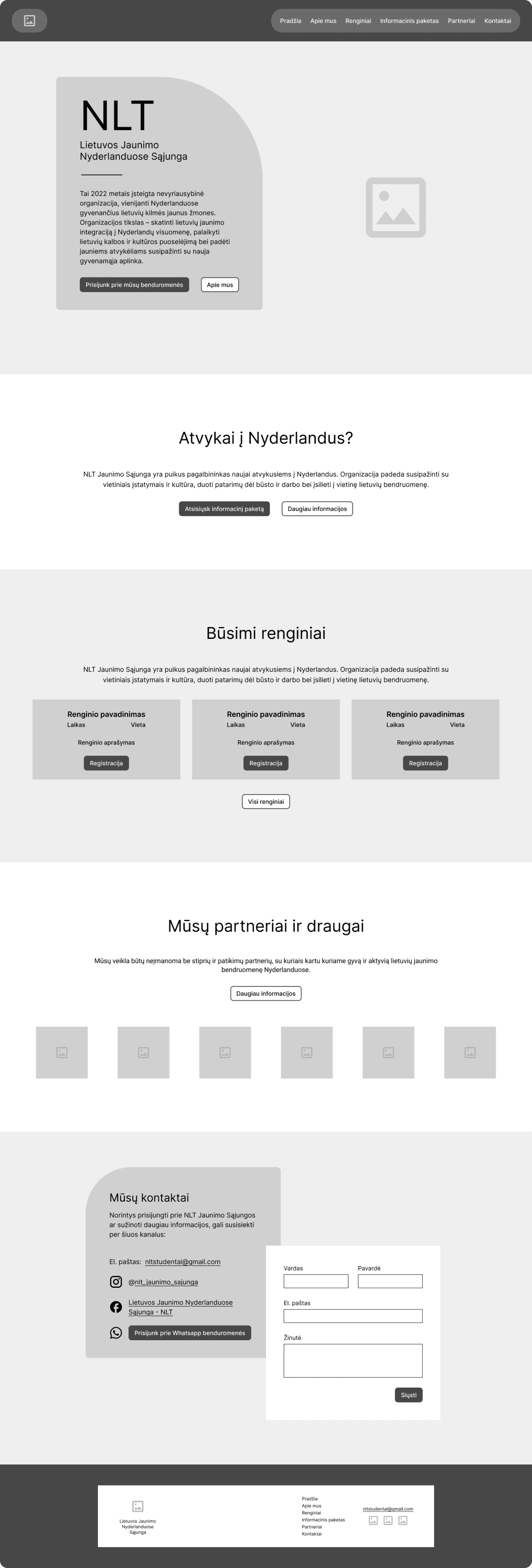
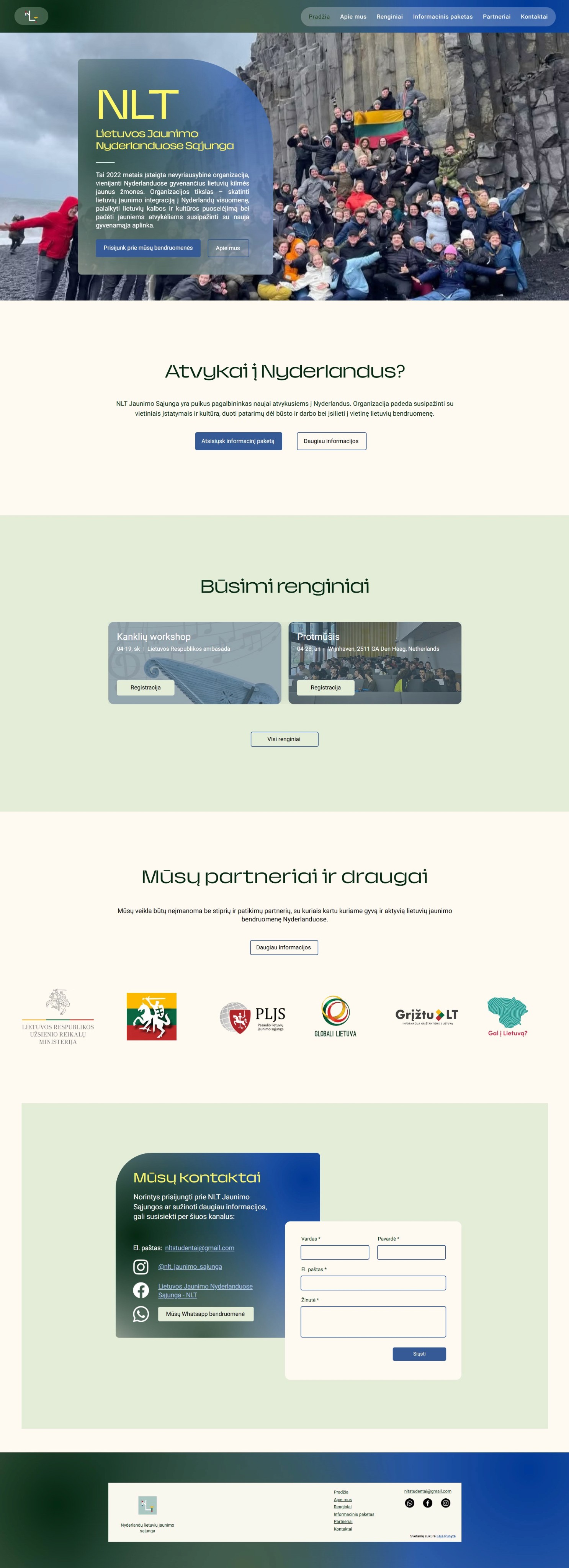
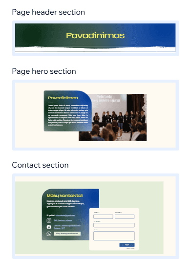
Introductory hero section
The first thing new users will see on NLT’s website is a photo of NLT’s members, a short paragraph about who they are and 2 CTA’s - primary for joining their Whatsapp community, secondary for their About section.
2 Priority - How can they help me?
Now that Laura is familiar with NLT, she wants to see if they can help her settle in. Users also may have browsed on social media and seen that NLT offers an Info pack.
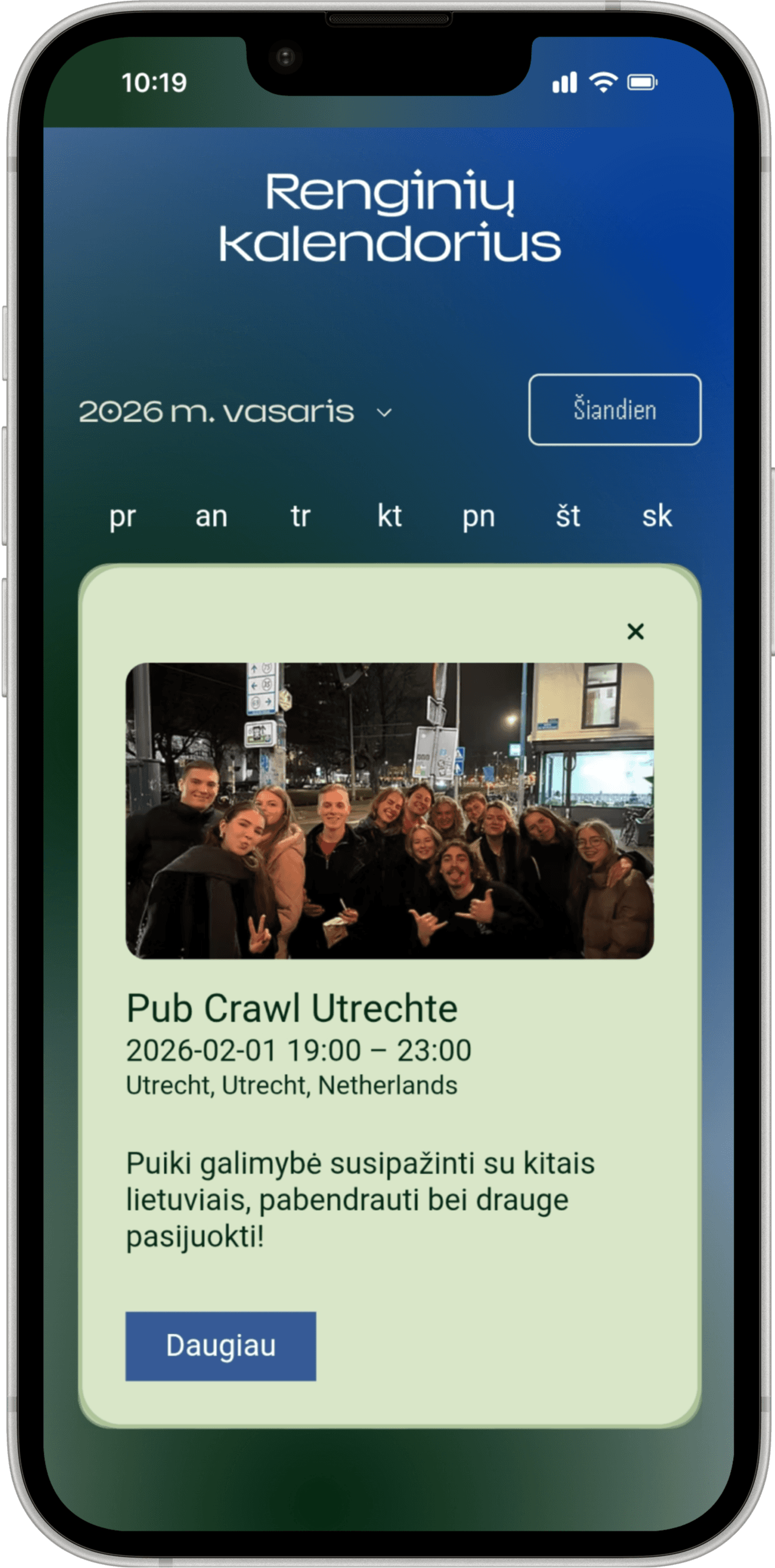
Info Pack section on homepage and as navigation item
When users scroll down the website, the next section bellow the hero section notifies users that NLT has an Info pack and offers 2 choices - download the PDF or jump to the Info pack page and read the digitized version there.
3 Priority - How can I contact them?
Laura has read the Info pack but has questions about a few things she needs to take care of. She wants to contact NLT and ask them for their help directly.
Contact form on homepage and as navigation item
When users read through all of the sections on the homepage they find a contact form with links to NLT’s email, Instagram, Facebook and Whatsapp community. It’s also available as a separate item for quick navigation.
4 Priority - Can I join their events?
After covering all critical points users like Laura are curious what kind of activities and events NLT organizes and if they can join them to find friends and relax from stress.
Event navigation item
Users will be able to see upcoming events on the homepage and all past and future events in the Event page. They will be able to register right on the website.
OPPORTUNITIES
Strategizing the overarching structure
It was important to not only create clear user and task flows but also lay the foundation of the website’s logic, structure and scalability for future handoff to NLT. Considering NLT had plans to expand the website to include more pages, sections and documents, I conveyed to them the significance of building a future-proof website from the start.
Establish a robust hierarchy
Create a logical information architecture, consistent navigation and clear visual hierarchy for faster information discovery and reduced cognitive load.
Create action-oriented pathways
Design strategic user journeys with intuitive navigation and cross-linked relevant pages to guide new users towards their goals while minimizing their decision paralysis.
Build a scalable platform
Integrate core features to create native workflows that don’t require third-party navigation and increase conversion rates.
SITEMAP
Laying out the website’s contents
I created a sitemap that visualized the website’s pages, sections within those pages and the integrated CMS content.

Designing & Iterating
DESIGN CHALLENGES
Le
There were several design challenges.
How do I work within the budget and resource constraints?
NLT had no budget, no technical resources and no human resources to build a website.
How I tackled the human resource constraint - From the meetings it was clear to me that NLT’s members were not quite sure how they would need to manage the website post handoff, since their members’ responsibilities were primarily in the administration, management and marketing departments. However, they revealed that they would be holding management elections and would likely hire more members. I strongly advocated for the creation of the Web and IT support position and NLT completely agreed.
How I tackled the technical resource constraint - In the first meeting with NLT I explained that I will design the website in Figma and build it in Wix. Neither of these would require their expertise. Later on, when it came time for handoff, I would train their members responsible for the website and continue support after the project’s end to make sure they are capable and confident about managing the website themselves.
How I tackled the budget constraint - I explained to NLT that it was entirely possible to build a remarkable website without a budget but that would impose certain limitations on us. Choosing a free plan would mean Wix’s name would be in the domain name and visible on the site. It would also deny them from having more storage space, certain analytics tools and marketing and payment possibilities. We discussed that these were not needed for the time being and could be left disregarded.
How do I create a new platform while preserving what already exists?
Since NLT’s formation in 2022, their users have had 4 years to become accustomed to their social media presence, communication and visual tone. How do I introduce a website without making users feel disconnected from it?
1
Take what’s already established
I gathered the types of services NLT was already providing.
Example: A core part of NLT is hosting events and inviting their users to them.
2
Group it into pages or sections
3
Echo user behavior
Having learned how NLT’s users interact with their services, I replicated these behaviors on the website.
Example:
Where do I place urgent information?
NLT stated that a news section was neither in the scope, nor the future plans, so I needed to figure out how to display the most critical information, e.g. instructions about voting in Lithuanian elections, in a way that would immediately catch users’ attention when they opened the website, but wasn’t jarring enough to interrupt their journey.
I looked to other nonprofits and youth organizations to define best practices and found that such information was usually placed on the home page either in the hero section as a slider or somewhere below the fold in a distinguishable box. I went through a couple of iterations and with NLT’s approval decided on a small strip just below the hero section.
How do I make the Info Pack more accessible?
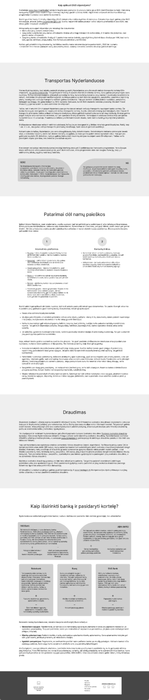
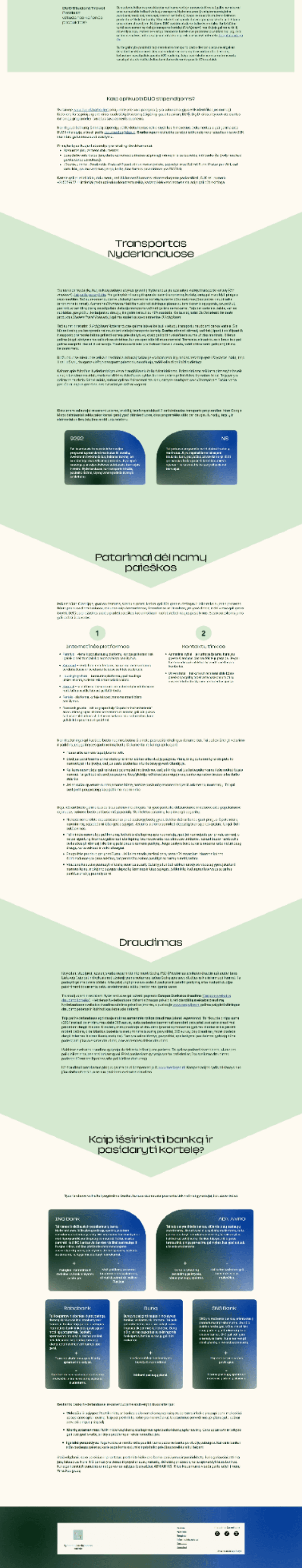
The Info Pack was created with the goal to serve as a comprehensive resource for new students in the Netherlands. However, the difficulty to locate, use and navigate the PDF is what’s deterring users from getting help and becoming part of NLT. Digitizing the Info Pack solves all of these issues while also implementing accessibility guidelines.
It’s important to note that the PDF will keep being available to users because of the easy offline access and possible edge cases, but will be reworked by NLT for better visual hierarchy.
Easy to locate
I simplified the user journey to end in the website and not lead to third party apps. I placed the link to download the Info Pack right below the Hero section on the home page as well as creating a separate page for the digitized version of it.
Easy to navigate
The 8 sections of the Info Pack are placed into a Contents list and linked to save users time and reduce scrolling. All mentioned resources and sites are also hyperlinked and open in another tab, letting users immediately check off their to-do’s.
Easy to use
The digitized version of the Info Pack can’t be lost among users documents on their phone, doesn’t need to be redownloaded if misplaced and provides easy scannability with clear hierarchy.
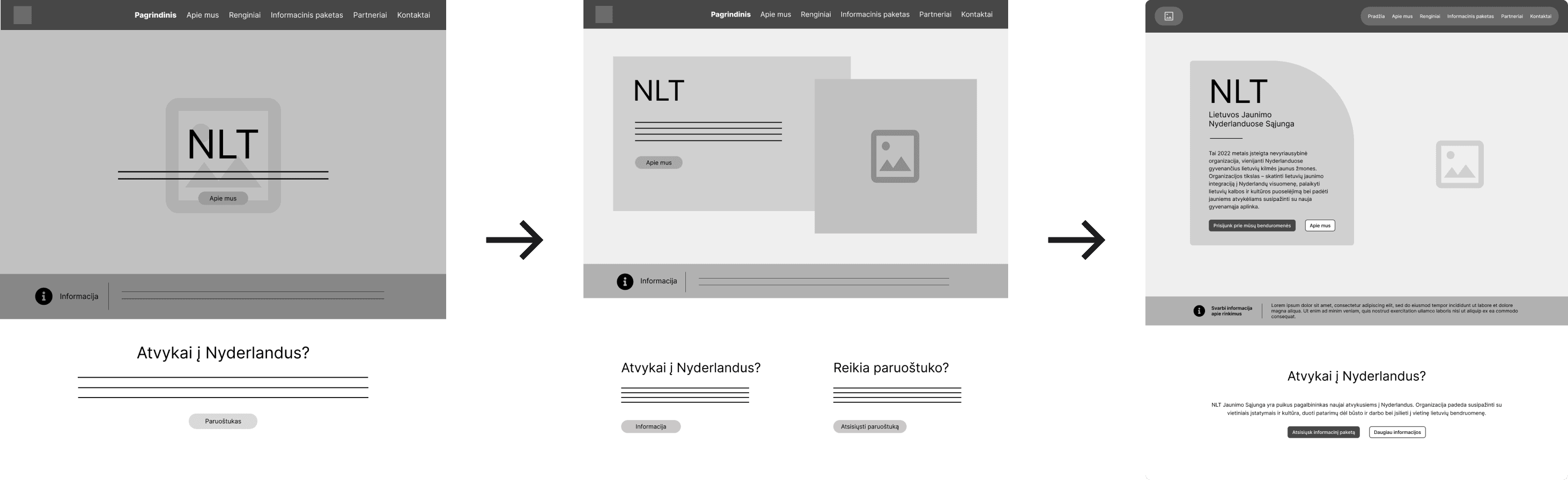
MID-FIDELITY PROTOTYPE
Mid-Fidelity prototype ready for user testing
With the main 6 designed pages it was time to move on to testing their usability with participants and their design and layout with NLT.
HOME
ABOUT
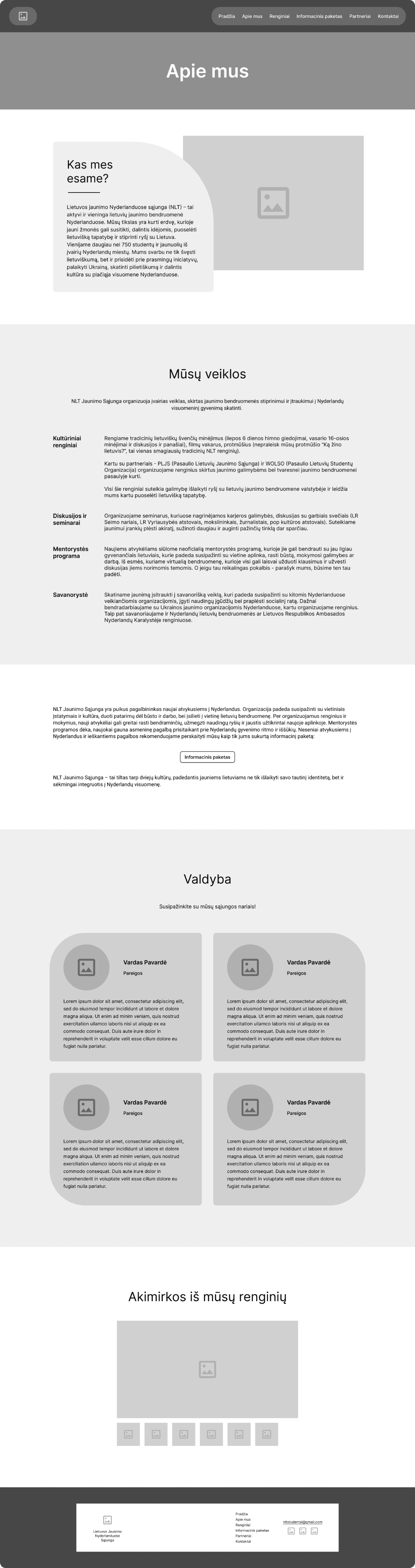
EVENTS
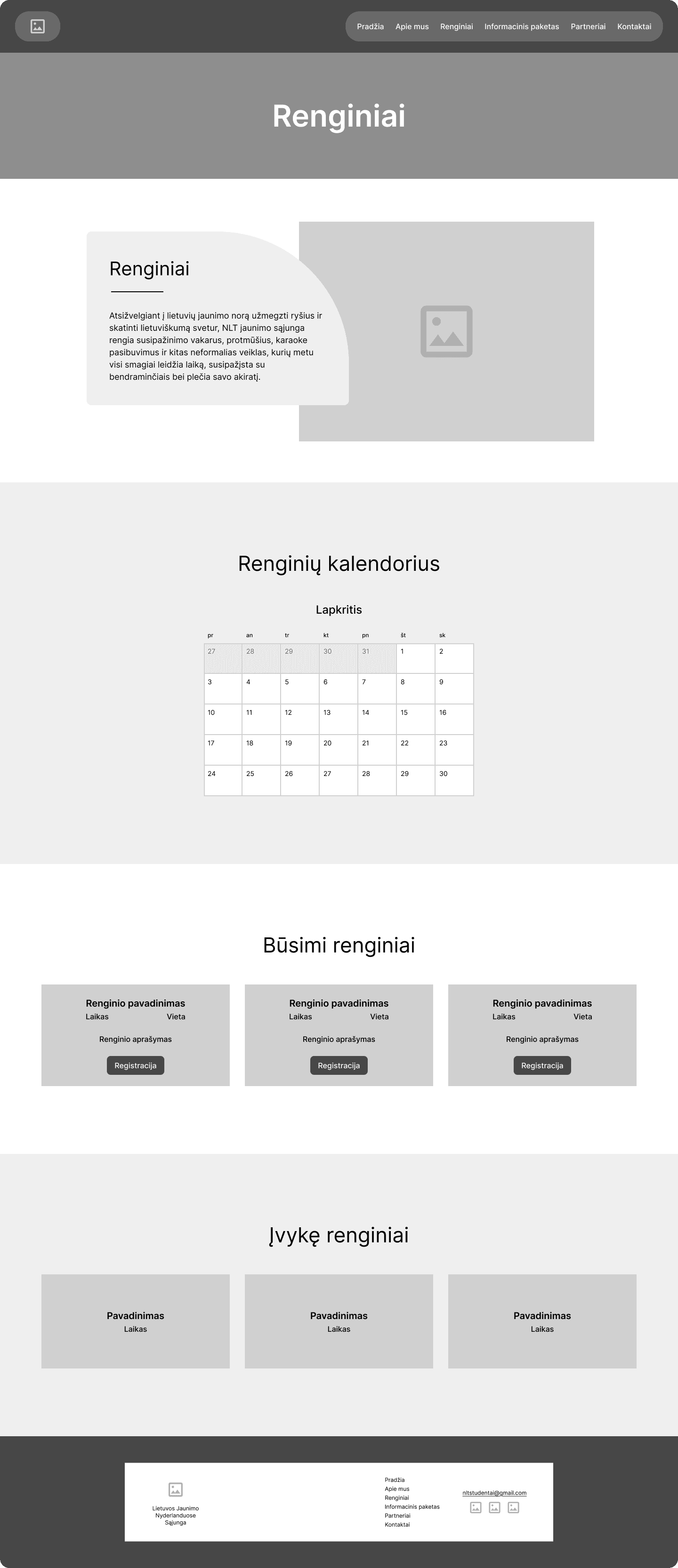
INFO PACK

cont.
PARTNERS
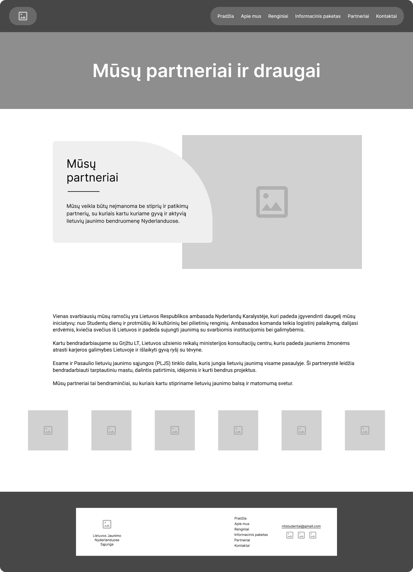
CONTACT

USABILITY TEST
Le
I conducted moderated usability tests not only with the users but also with NLT to stay on the same page content and design-wise.
The test with 6 participants validated that, but recealed areas for improvement. Insights led to refining and adjusting.
segmentuot valdyba
Before
The Final Design
I used the CMS tools at my disposal and created the beginnings of the tab pages in order to lay all most important info d
HOME
ABOUT
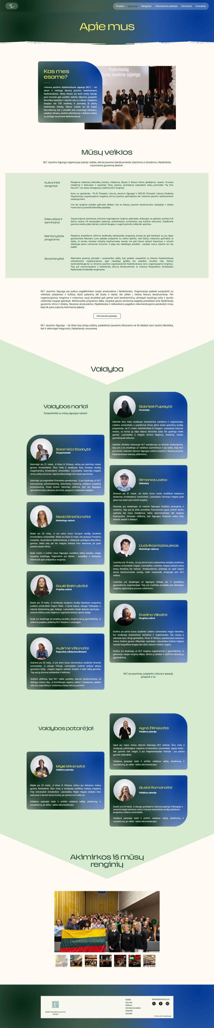
EVENTS
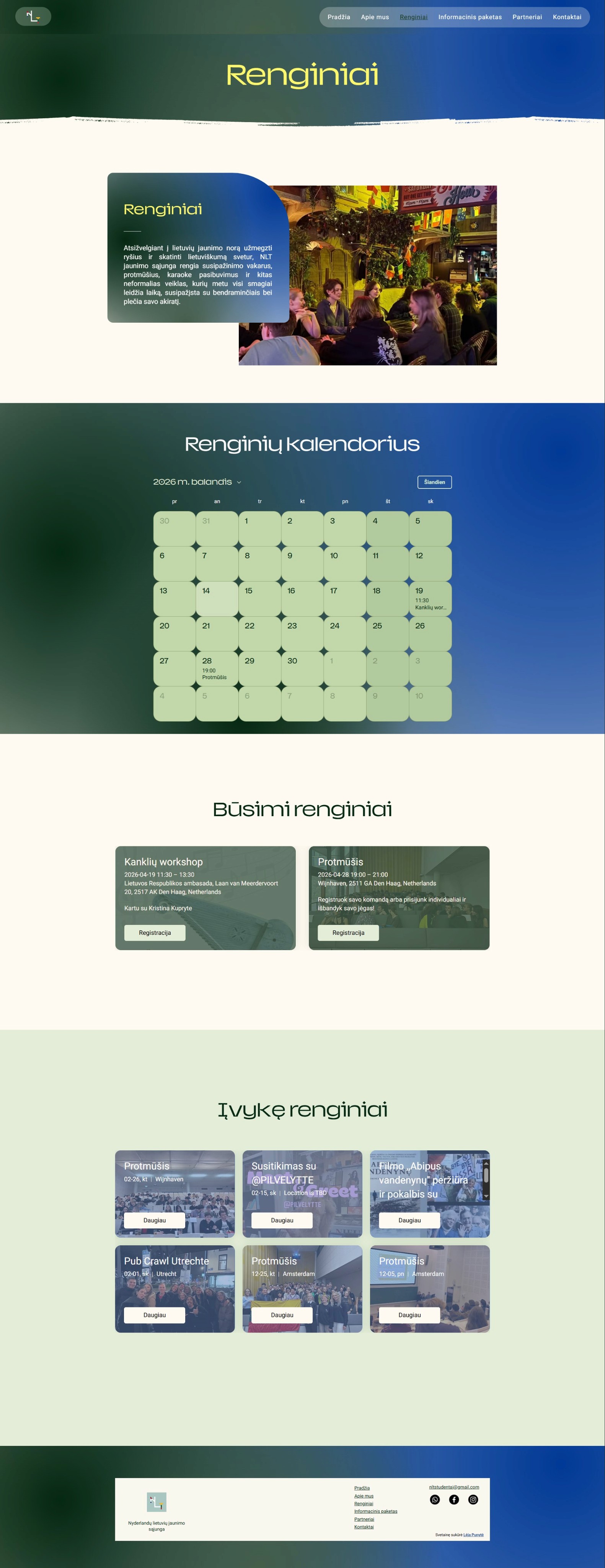
INFO PACK

INFO PACK cont.
PARTNERS

CONTACT

KEY DECISIONS
Key decisions
Streamlining the navigation
I structured the home page of the website to match the defined user journeys, leading users through sections, arranged by priority, and allowing to reach related pages for full information.

Leveraging Wix CMS capabilities to integrate features
I utilized Wix’s CMS tools - Events and Contacts - to integrate features directly into the website. The event tool? facilitates the function of the event calendar, creating event pages and handling registrations. The contact form allows users to submit their inquiries. This decision required minimal upkeep from NLT while maximing the impact for users by reducing their cognitive load, increasing convenience and creating frictionless user journeys.
PAST EVENTS


Developing a phased implementation strategy
In meetings NLT divulged possible future plans for content to add to the website - By-laws section in the About page, News page, expand and segment their Partners page.
We agreed on the phased implementation strategy in order to introduce changes to their community gradually, giving users time to adapt by presenting a fully functional website and leaving more specific decisions for later releases. This strategy would mitigate the risk of overwhelm, allow to gather feedback for improvements and collect users’ suggestions on features they would like, ensuring user-centered design.
Designing for scalability
During the development phase I kept in mind that I will need to transfer the website to NLT. That meant that I had to create a modular design system that could be reused. Since Wix’s interface? limited the amount of intricacy to the components, I had to only use sections?. Typography, color palette.
I also mentored a member of NLT how to create navigation items, pages and manage the CMS.


Impact
This project was very fun and insightful! I really enjoyed building a solution to a problem
REFLECTIONS
Lessons and takeaways
This project was very fun and insightful! I really enjoyed building a solution to a problem that I also had in the past. It motivated me to work closely with the team and their users to give them the best I could. I also appreciated expanding my Web design knowledge with Wix. I’ve grown a lot during this experience and looking back I would approach some things differently.
What I learned
Project management skills are invaluable
Although I had previous project management experience, this was the first time that I also had to design and build the product.
I prioritized keeping an open line of communication with NLT, balancing their requirements with user needs and providing guidance for technical decision making.
Adaptability helps navigate constraints
Being versatile allowed me to transform budget and technical limitations into creative opportunities to learn new platforms (like Wix) while providing impactful results.
Leveraging existing systems helped bridge the skill gap between me and NLT while delivering a much needed solution to the users’ problem.
Designing for scalability benefits both user and clients
Since NLT wasn’t sure what types of content and features they wanted to add in the future, I built a flexible component system in Wix (known as x) that could scale as NLT’s roadmap evolved.
Constant discussions and a training session empowered NLT’s members that they didn’t need complex know-how and could easily build and grow the website themselves.
What I would do differently
Diversify research participants
I focused mainly on new users of NLT - newcomers to the Netherlands - as well as their existing users.
On the other hand, talking with other members of their community that don’t fall into the typical age brackets would give me a broader perspective and maybe some edge cases to work around.
Conduct A/B testing
I mostly relied on feedback meetings and usability tests to align goals and resolve issues.
However, A/B testing enables data-driven decisions, not just opinions, while cutting down on time-consuming iterations. It would also narrow down options and reduce NLT’s cognitive load.